Staying current on web design trends is crucial to the success of your website. A lot changes every twelve months in terms of popularity with visuals, algorithm updates, and best practices.
A website that looks sleek and modern today could look outdated and cheesy in just a few months’ time. That’s why knowing the difference between a trend in the industry and a passing fad is so important when designing your website — you want to ensure that your design will look great for several years and not reminiscent of a Geocities message board from 1996.
2019 will be all about delivering on user experience: web design trends will prioritize speed and mobile design, eye-catching simple designs with asymmetrical layouts, immersive video backgrounds, and more.
Speed
How much time do you think that you get to make a good impression with a potential customer? If you’re talking about interacting with them online, you have less than three seconds.
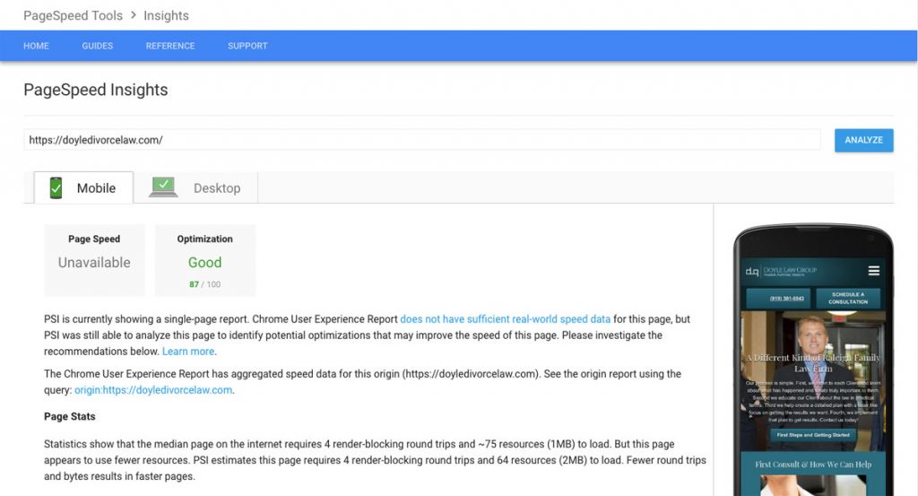
Humans tend to be flighty and impatient. If the internet is really an alien conspiracy that observes human nature, their alien studies would show that we don’t like to be kept waiting. In studies done by Akamai and Gomez.com, 50% of users expect that when they click on a site, it should load in two seconds or less and that they will abandon a site if it takes three or more seconds to load.
As you can see, a beautiful site is a beautiful site, but if the design is so data-heavy that it takes too long to download, you could be losing loads of revenue due to no one sticking around to even look at your site. Even worse, with the Google Speed Update that went into effect in July 2018, Google has begun prioritizing rankings for sites that load faster than others, and it’s likely that other search engines are soon to follow.
What all of this means is that as websites need to load faster, so does web design need to prioritize speed during the design process. Web designers can’t simply rely on the developer to turn their work into something that will both look good and rank well — speed needs to be a design parameter.
The days of gigantic photos, uncompressed videos, and bloated Javascript are over. While large pictures and videos aren’t gone from web design, in 2019 they’ll be incorporated in such a way that they don’t slow down loading times.
Flat Design
In 2017, designers and developers began creating clean and simple websites for better mobile performance. Since then, the number of mobile searches has gone ever-upward, and mobile-first design for websites is now a necessity, not just an option. Image-heavy websites load slowly and frustrate mobile users, as we discussed earlier.
Clean, minimalist designs, or flat designs, are characterized by loading quickly and are currently trendy and desirable for two important reasons. First, both mobile users and desktop browsers can experience quick-loading websites. Secondly, they can hold high SEO value. Flat design helps a site fulfill a lot of the speed requirements that search engines are starting to require. This’s why flat design has started to become popular and will continue to be trendy into 2019.
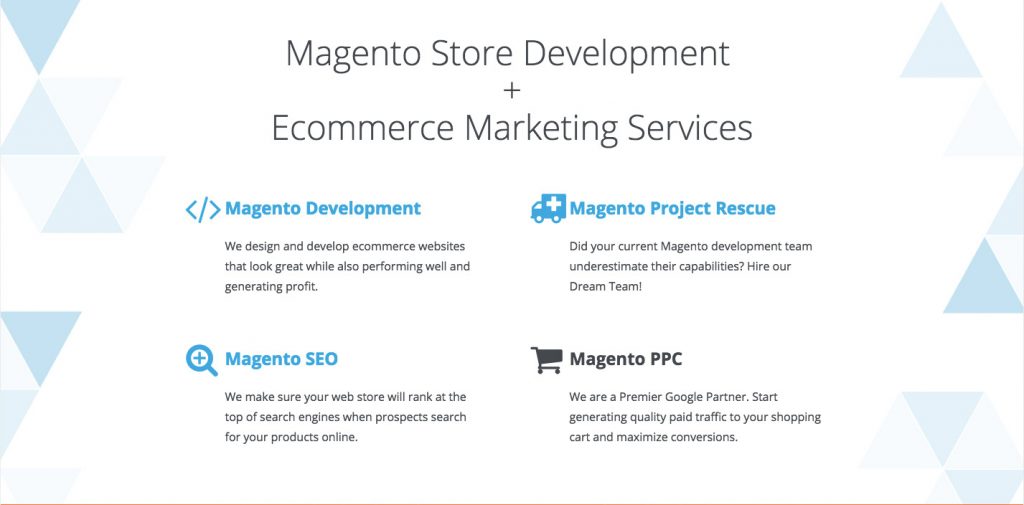
Flat design doesn’t mean that everything is reduced down to two dimensions — it’s all about minimalism and usability. It’s a design aesthetic that gets rid of clutter and focuses on the important parts of your website. Utilizing bright colors, clean and crisp edges, and lots of open space, flat design is a refreshing change from distracting and slow-loading hi-res image-based designs.
In spite of being minimalist, this doesn’t mean that flat design is boring. Contrasting bright colors and illustration with simple imagery and sans-serif fonts, the sum of flat design’s parts comes together to provide an excellent user experience that is eye-catching and engaging.
Since flat design doesn’t rely on pictures to be captivating, it doesn’t have large amounts of extra data to load when a user navigates to the page. This means two really great things for website owners: the first is that customers and clients, no matter if they’re browsing on mobile or otherwise, will have an enjoyable, quick-loading experience on the website. Secondly, these data-light, fast-loading designs make page speed and optimization much, much faster — which looks really desirable to Google, Bing, and pretty much every other search engine. Like we discussed in the speed section, faster load times mean that your site is more likely to rank well, and with an engaging flat design users are apt to stay longer on your site and are more likely to convert.
Mobile First
With mobile sites taking priority away from desktop sites, it’s no wonder that mobile first design has become a trend. Mobile first web design is about changing the way that websites are designed fundamentally. The standard used to be that a site would only be designed for a desktop or laptop computer and a mobile-friendly or mobile responsive design might be added as well. Mobile first design does just the opposite: it starts with designing the site for the mobile user first before creating a version that will also work for a desktop user.
Again, this push toward mobile first design isn’t just based on ranking factors or SEO. The visual result is something that will first and foremost enhance the user’s experience with the website on the device that they will most likely be searching from. This design trend is meeting the demand that mobile users are requiring and will likely be the trend for a long time to come.
Broken Grid/Asymmetrical Layouts
In 2019, web design trends are all about thinking outside the box, or rather, the grid. Broken grid and asymmetrical designs are leaving their mark across the web design industry in a big way. In spite of the push from many web designers towards flat, fast, minimalist design, there’s also a large contingent of designers advocating for the fresh, striking look of broken layouts.
When we talk about broken grids or asymmetrical layouts, this refers to the grid system that has been used for decades on all kinds of layouts, from web pages to newspapers to print and outdoor ads. A grid system helps a designer maintain alignment and consistency easily when they are adding content — images, headlines, copy, calls-to-action — to whatever medium they are working in, maintaining the structure of the grid in the underlying layout while generally maintaining symmetry as well.
Historically, not using a grid or “winging it” has resulted in what many have called sloppy or distracting designs that keep the user from focusing on the most important parts of the page. However, asymmetry and broken grids have been gaining more and more popularity, likely due to having found a way to not look like most other website designs, while at the same time not being distracting or sloppy.
Designers are able to achieve this through carefully and thoughtfully breaking the grid pattern and establishing hierarchy with planned asymmetry. The use of unusual placements, layering with different colors and textures, repeating irregular patterns, use of white space, and creative use of typography create a sense of depth not normally found in grid-based layouts.
These designs are striking, helping to engage users and point them towards the most important parts of the website, but not due to established, rote design patterns. Instead, creative use of visual hierarchy directs the eye on where to look. Using colors, shapes, textures, expressive use of type, and dynamic imagery, the designer can direct the user’s attention in a new, engaging manner toward the content or the CTAs that they want users to find.
Shapes
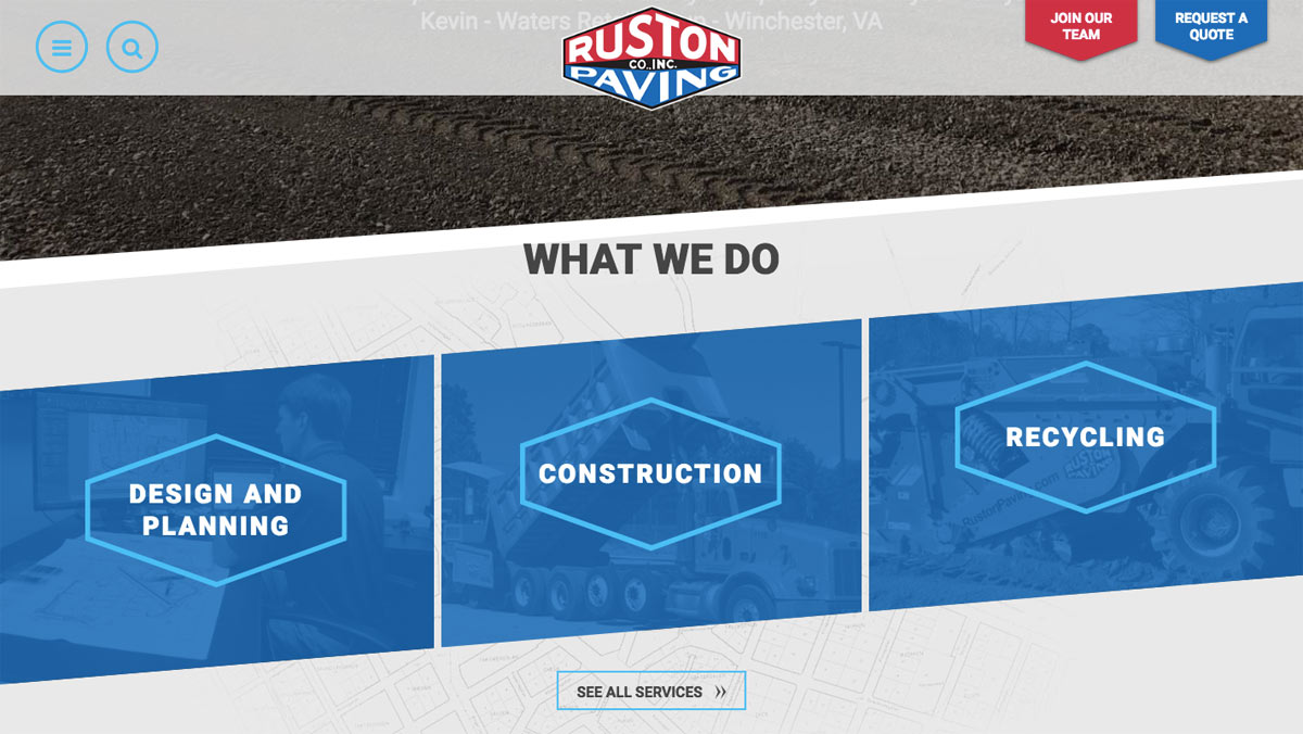
As a middle ground trend between the minimalism of flat design and the controlled chaos of broken grid lies the trend of geometric shapes. If you think this refers to simple, Euclidean geometric shapes that you learned about in middle school such as triangles, hexagons, and circles, then you’re absolutely right.
Shapes can bridge the gap between flat and broken grid because of how easily they can be integrated to a design. Simple geometric shapes with bright colors can create interesting edges and load quickly while still being engaging. Designs that compost shapes with photography and type or that use shapes to create repeating patterns can result in the dynamism and depth present in broken grid or asymmetrical layouts.
This versatility is a large part of why shapes have become a trend in 2019. The underlying math of geometry helps establish a feeling of balance on a website, even when the visuals might contain asymmetry. Often, geometric shapes easily fit into or next to one another easily, establishing organization or hierarchy quickly.
Shapes are like colors in that there are thoughts and emotions that people naturally associate with each one. Rectangles represent stability, circles are unity, and triangles and rhombuses are dynamic. Creative use of particular shapes or combinations of shapes can be used to mold the emotions or feelings that you’d like your website visitors to feel.
They can be used dramatically or sparingly — it simply depends upon your brand aesthetic. Shapes easily help you establish visual hierarchy and draw attention to parts of a page that you want your visitors to notice, even when your site has stepped away from a traditional grid design. That’s why we’ll continue to see geometric shapes in web design in 2019.
Single Page Design
Speed and minimalism are the trends that come up again and again when talking about web design in 2019, which is a major reason why single page design, also known as pageless design, has also become a 2019 web design trend. Single page design is a very descriptive title — it refers to websites that have only one page instead of multiple service pages or blog articles all neatly arranged under a siloed hierarchy.
From a traditional SEO digital marketing standpoint, this likely would seem to be a mistake — it’s going to be much harder to rank for particular keywords without the pages and the content that you would normally have, nor would it be easy to accomplish other advanced SEO techniques. Yes, while it can be harder to use particular SEO tactics on pageless design, that’s where the cons of it start to drop away.
As was discussed in the speed and flat design, uncluttered, clean, simple websites are being favored by search engines as they can quickly and easily be downloaded on mobile devices. Pageless design achieves that by having less of everything that can slow a website down. The HTML, CSS, Javascript, and pictures aren’t bogging the site down with data to be downloaded, making it a better experience for the user and granting priority in the search engines.
This simplicity is doubly great for single page websites as they look great on every browsing device and automatically fall into being a mobile-first-style site. Being so simple means that it’s more easily managed, too. Updates to the site are often quickly achieved since there are so few things to change or update, which means it’s easier for your business to stay current with your website.
Businesses love pageless websites for more than just ease of use: they also tend to have high conversion rates. On a traditional hierarchical site, it’s all about grabbing a user with a keyword search, getting them to land on your site and then funneling them towards a contact form, page, or phone number. With single page sites, there’s nowhere for the user to get distracted — every part of the page drives them toward a conversion point, getting them more leads and more business.
While single page design likely won’t take over the future of web design, it will certainly continue to leave its mark through 2019.
Video Backgrounds
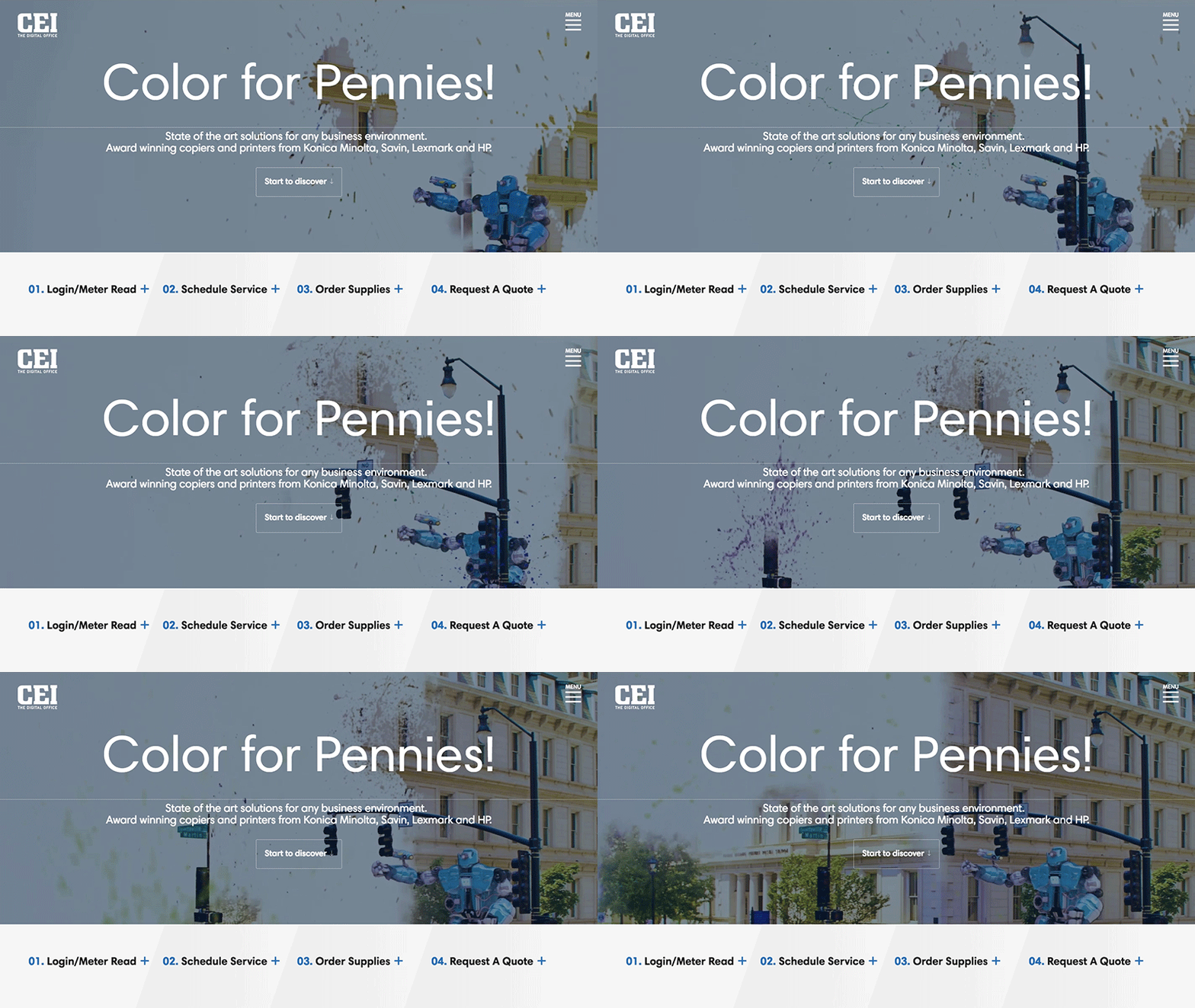
In spite of the minimalist, quick-loading, flat design trends, video backgrounds are still incredibly popular as a trend going into 2019. You might think with speed being such a huge factor this year that videos would bog down a site too much, but, interestingly, video backgrounds have been shown to increase conversions.
Videos are simply more compelling than text or images ever will be. You’ll likely have seen this trend appear on social media platforms like Facebook over the last couple of years. Video posts are prioritized over other kinds of posts. They even made it easier to watch videos by auto-playing on mute while you scroll through your feed.
When a user lands on your site and a video plays in the background, they’re likely to stick around to watch it because videos are attention-getting. The more that a user stays on your site, the more likely they are to convert. This, in turn, raises your time on site metric, and the higher your average time on site is, the better your SEO is.
The power of video literally can’t quite be stated in words — they convey your message quickly and effectively, something that it could take paragraphs of text to accomplish. The video does it in a matter of seconds. This is especially useful when you have a complex message to explain to your users in the short amount of time that you have their attention.
Finally, there’s just something sleek and modern about a video background on a website. As long as the video is short, is muted, and has a nice, high-quality look to it, a video background can do a lot for your branding.
Micro-Animations
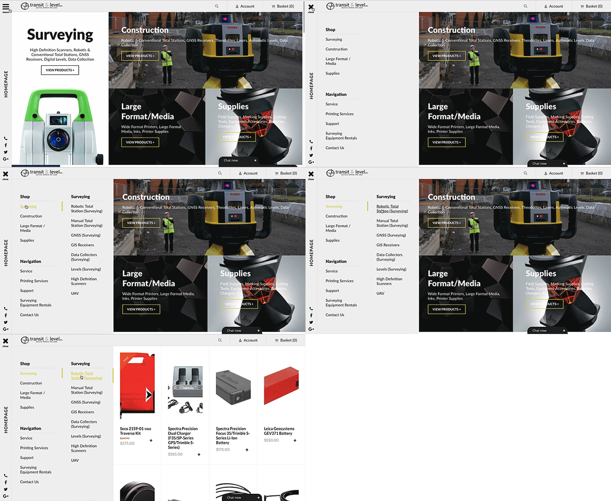
A subtle but noticeable 2019 trend in web design is micro-animations. Micro-animations are a powerful way to provide an intuitive and satisfying experience to your user as they browse your website. This is accomplish through small animations that help the user understand the site and validate them when they mouse over or click on an element, such as changing the color of a button when the cursor moves over it, or a menu expanding when they click on the hamburger.
Most users experience these micro-animations all the time on both desktop and mobile browsing platforms. It’s so pervasive in browsing now that it’s more surprising to not experience them. These animations help the user know that they’re doing the right actions as they progress through your site. Did you press the submit button on the form? It changed color when you clicked it. How do you quickly refresh the page? Swiping down creates a pulling motion to let you know you triggered the refresh action properly.
Remember how moving objects like videos help with user retention and attention? These movements, even though they’re small animations, help to catch the eye of the user and create an enriched experience for them as they navigate a site. In turn, proper use of micro-animations creates visual hierarchy on a webpage, driving visitors toward your conversion points and then rewarding them for filling them out.
It might seem too simple or silly to think that a micro-animation can “reward” a user for clicking submit on a form, but think of that tiresome Captcha that so many forms use. If you’re lucky, all you have to do is click the checkbox, but if you have to go through the process of selecting pictures or typing out a number and letter string sequence, there’s nothing more satisfying than watching the circle swirl into a checkmark. As 2019 approaches, micro-animations are here to stay in the web design industry.
Chatbots/Machine Learning
Over the last several years, interacting and communicating with bots has become more and more normal. Bots, or chatbots, are becoming increasingly common on websites and micro-interactions across digital media. It’s likely that you spoke with one the last time you called your mobile service provider.
When they first started rolling out close to 20 years ago, these bots seemed to make it more difficult to solve problems (remember over pronouncing your commands in a loud, firm tone?) but over the years, they’ve gotten smarter thanks to improved artificial intelligence (AI) and machine learning. These are what help Google create autosuggestions when you start typing in the search bar.
This is also why Facebook knows us so well. It’s helped Facebook learn what we look like and asks if we want to tag ourselves in a photo. It also uses location data and has learned our reading habits so it knows exactly which ads, events, and information to show us in order to get us to hit a “like” button.
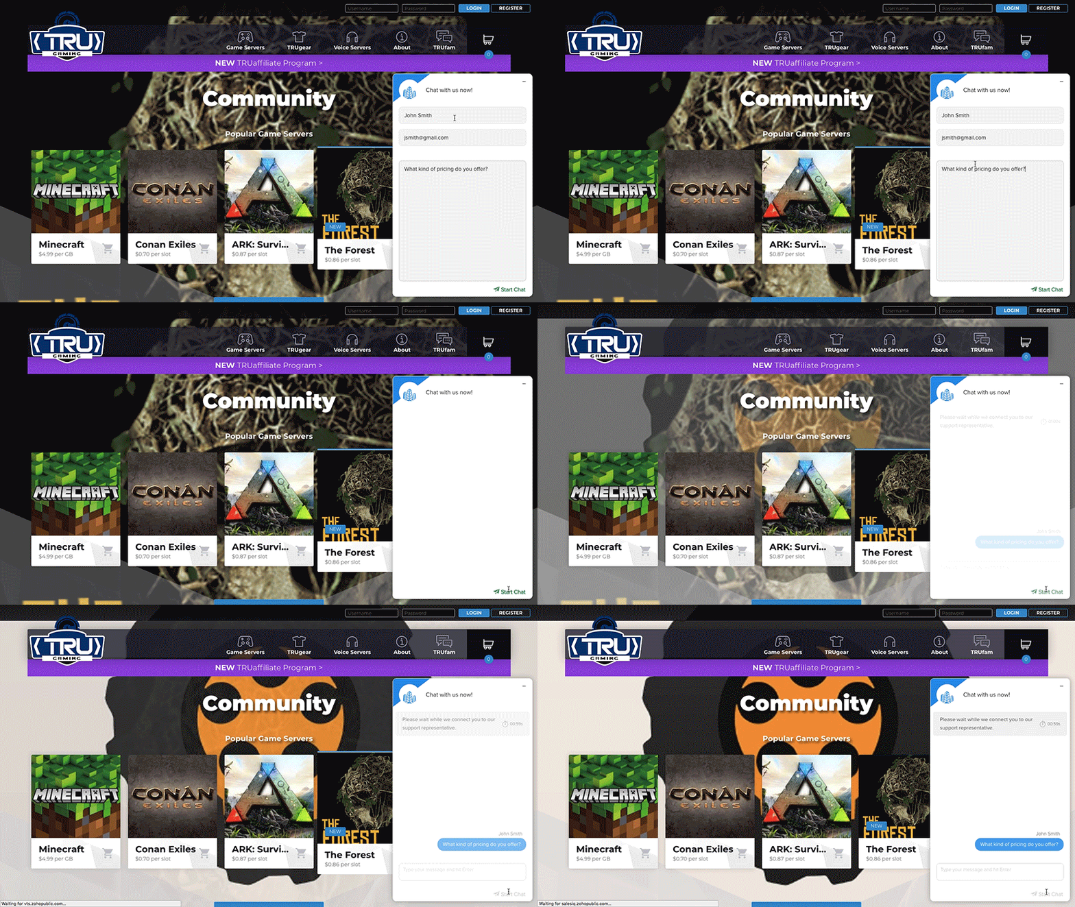
Chatbots and machine learning will continue to enhance user interactions with websites, especially as autoresponder functionality inherent in most chatbots can seamlessly interact with users for you and provide excellent customer service upfront. This starts your relationship with potential customers off on the right foot while simultaneously gathering info for your sales team before they begin actually interacting with the prospect.
In 2019, this technology will continue to be perfected and incorporated into company websites. Soon, web interactions will become seamless. Imagine a website that already knows exactly what your customer is looking for by simply analyzing their past interactions with your company. Customer service via the web is becoming faster and more efficient every day thanks to these new technologies. Don’t overlook them in your web design.
Web Design 2019 — Engaging Minimalism or Attention-Grabbing Visuals?
2019 might seem like the Janus of years for web design: on one side are the tempting visual delights of broken grid layouts and video backgrounds. On the other side are the beautiful but practical tenets of flat design and single page layouts. As trends change, so does the industry. Staying atop those trends will help you keep your website fresh, beautiful, and making conversions.


